Case study: Visualising hope
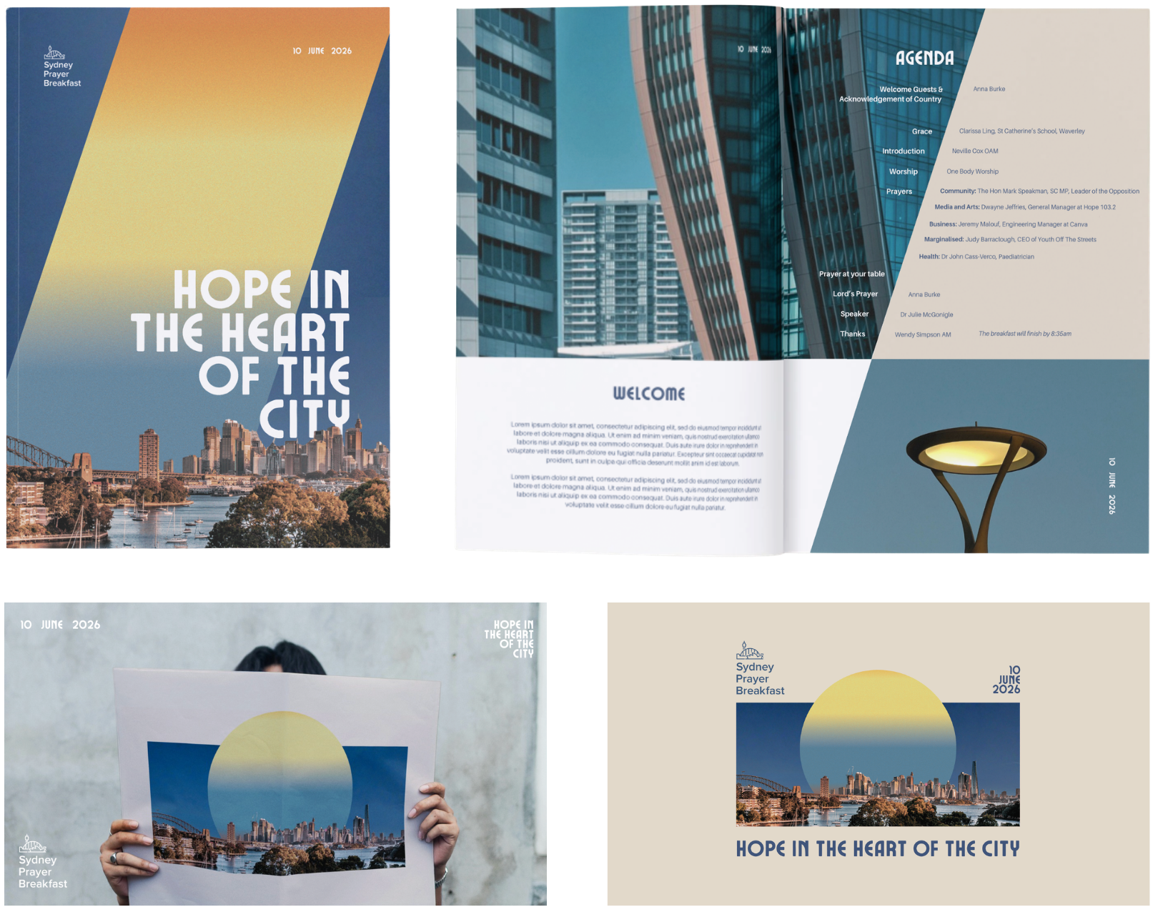
One of my favourite projects to work on recently was the event branding for this year’s Sydney Prayer Breakfast. They were hoping to attract younger attendees with a fresh new look.
Our Comms Strategist developed three theme concepts, which I then expanded into three visual concepts.
The client chose the theme pictured below, “Hope in the Heart of the City”. The anchoring idea for this theme was: God places His people as light in every sphere (Matthew 5:14–16).
The branding needed to visualise the following:
Hope / Light
Sydney
Kingdom Transformation
I chose coloured gradients to represent light and hope breaking into the city. I wanted to gradients to be reminiscent of a sunrise, suggesting a new dawn, fresh mercy and renewed vision. I hoped to layer these with collaged elements of the iconic Sydney skyline to create a sense of shining, and transforming the city.
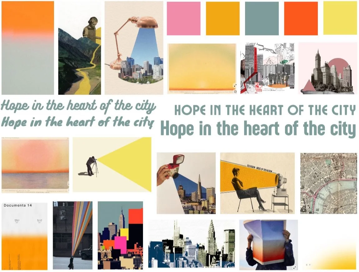
As I brought the design elements together, I wanted to give the designs a nostalgic archival feel, as the theme title reminded me of a newspaper headline. I did this by adding noise to the collage elements and by keeping the colour palette slightly muted - this also allowed the vibrancy of the gradient to pop!
Here is a sneak peak of the final designs!